There are those who enjoy driving to their destinations. For many people, driving the open road and seeing new locations is all part of the adventure. There is, however, no one who enjoys finding parking. ParkIt is an application whose purpose is to make finding available parking simple and stress free while answering any questions the user may have without deciphering confusing and convoluted parking regulations.
To create an efficient application that will fulfill a users requirements to quickly and easily find parking that suites their preferences and minimizes confusion.
Solo Conceptual Case Study
User Experience Designer
Sep 2022 – Oct 2022
~4 Weeks (Part time)
As long as someone drives and has experience with parking, they have important insight we want to know that’ll be vital to understanding the product we’re attempting to create.
We need to know who makes functionality similar to ours so we can understand what positives can be further improved and what negatives can be avoided so our product is the best of the best.
Listening first-hand to people’s experiences and pain points will help us empathize with our users and understand what’s needed to create an efficient problem solving solution to our problem.
We launched a survey on Google Forms and had 9 responses from users which shed light on the much needed quantitative data that will help us statistically determine a researched plan of action when moving forward.
of surveyed users felt that the price of parking was the most important factor for finding parking.
of respondents left a potential parking location because they were confused on if they were able to park there or not.
of respondents simply leave and find parking elsewhere if they’re unsure about parking rules, regulations or pricing.
of respondents left a parking spot because they felt unsafe leaving their car there unattended.
of respondents take pictures of their parking spot to remember where they parked.
There are definitely some standouts with those who’ve created parking apps, but there are definitely cons alongside the pros. Let’s see who does it best:


Iconography is essential
These apps can be used by those who are looking for parking fast if they’re in the middle of a busy area. Being able to decipher iconography quickly is essential to a good user experience and should not be taken lightly
Choosing a start time and end time of parking is essential
It is universal practice within all parking apps to put a parking start time and end time. This may be difficult if users arrive late or not on the hour (ex. 12:36 as opposed to 12:30 on the dot)
Zones are highly confusing
A few apps allowed you to use “zones” which, to someone who doesn’t know the city, can be very confusing and basically useless.
Those who park more than likely lived through a horror story about a time where finding parking was a nightmare. We need to hear these stories and learn how they can best be avoided. We had a discussion three people who will help shed light on why parking can be such a nuisance.
Location: Los Angeles
Apps Used for Parking: Waze to find parking structures
Location: New York
Apps Used for Parking: Google Maps to drop pins
Google maps to drop pins
Location: San Francisco
Apps Used for Parking: Spot Angels
Those who live in busy, urban environments usually have the most difficulties finding parking whether it be from over crowded areas or convoluted parking signs. These are the people whose process and pain points we want to understand as parking in these busy areas are the most stressful to park in.
Let’s take the insights we’ve discovered during our interviews and condense them into a persona that lays out our interviewees’ habits and pain points to make them easier to digest.
An empathy map will look into what our users are seeing, thinking, feeling, and doing. In this case, we’ll delve into how Patrick “Streets” Parker reacts when he is going through the process of parking.
What are our users truly going through when parking? What’s their journey like? Let’s hop in the passenger seat with Patrick and figure out the highs and lows of parking his car.
We know what our competition is up to and can understand and empathize with how people think when parking
Now let's organize our information so we can to build our product on a solid foundation
Let’s start building! Our user flow will show what our user will have to navigate through to use our product. Let’s start off with the basic functionality our product will showcase: finding parking quickly and efficiently!
We’re now able to put the research to use by creating some wireframes which will be used to create a working prototype based on our user flow.
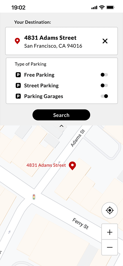
We have a MVP! Let’s get it into the hands of users to see where what’s working and what need improvement.
We tested three users. People use a navigation app of some kind to find efficient routes to parking or destinations. These apps show similar patterns that users recognize to minimize confusion and make for a streamlined experience. Let’s observe how our users fare with our product.

Find the location of the nearest parking garage to their destination, get directions there, and drop a pin on their parked location once they’ve arrived.
Find available street parking between two specified streets near their destination, get directions to that street, and drop a pin on their parked location once they’ve arrived



Usability Test 1 Revisions
Based on the results and observations of our first usability test, we have ideas on what can be improved with our initial design.
We've received solid feedback on our product and know how we can improve the experience...
... Now let's improve and create a higher fidelity product for further usability testing
With a basic design system in place and changes made to our platform based on information from our previous round of usability testing, we focus on turning our lower fidelity concepts into a higher, more defined product and another round of usability testing.

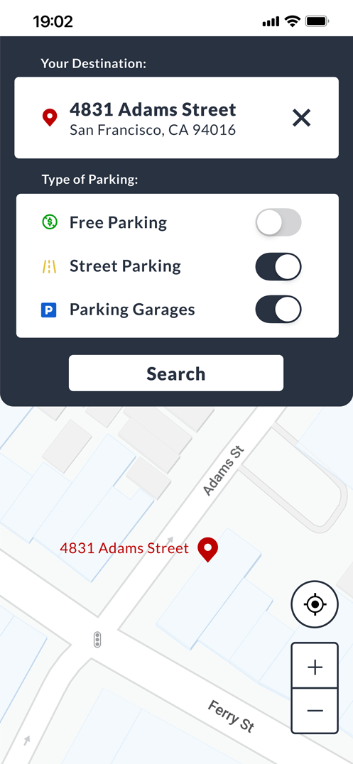


Armed with the knowledge gained from usability testing and an updated, high fidelity prototype, I had a more refined product that was ready for further testing.

Taking into account what we learned from our first round of testing, we will move to our next round of user testing. We will again time how long each participant takes and deeply discuss their thinking process while navigating the new prototype.
We asked for the same tasks from our first round of usability testing. All three participants were the same from the first round of testing.



Improvements from First Round Usability Testing
Improvement in completion speed
Overall less confusion when navigating platform