When the world was forced to shift to a digital teaching environment brought on by COVID-19, music educators had an additional need for organization of materials and scheduling to cope with students in their music classes. Since bands can only get together in-person to properly rehearse, the need to streamline online music lessons was more necessary than ever.
Create an easy-to-use lesson booking platform in which music instructors can quickly book and manage music lessons with their students whether meeting in-person or meeting online
Solo Conceptual Case Study
User Experience Designer
Jun 2022 – Jul 2022
~4 Weeks (Part time)
By reaching out to other educators, we can grasp what issues and pain points arise from booking lessons online with students.
Researching what the market currently has to offer will inform us what has been done and what can be done better.
Discussion with users will bring out the pros, cons, and expectations of managing and initiating music lessons.

With a link to a newly created online survey and a tight deadline, I decided that one of the quickest ways to get valid results to my survey was by reaching out to relevant Reddit threads where I could get relevant feedback.
of surveyed users felt the overall experience of online lesson booking could be improved
of surveyed users don’t currently use any kind of online platform to book lessons
of users felt that the booking process was the most frustrating parts of arranging lessons
of users felt that connection issues are the most frustrating part of the entire online lessons
of users felt that finding an instructor with both real life experience and reasonable pricing were the most important factors when searching for the right instructor
The marketplace for music lesson booking is not heavily saturated. As such, I was able to compare the majority of competition that is currently available.


A decent amount of the competitors in this space seem unsure of what they’re trying to be. There were sites that provided lessons, but also did larger format classes where the UI became clunky from their 1-on-1 sections.
All sites had different ways of showing off their list of instructors. Some just made list with nothing pictures of their faces first. I don’t think this is proper way to represent someone compatible. Takelessons.com definitely did this best by showing their experience and accolades as well as a picture.
Most if not all of these websites offer lessons both online and on-location. Since we’re at a point where COVID tensions have slightly loosened, both online as well as on-location lessons should both be represented to no block off any potential revenue streams.

Age: 33
Occupation: Freelance Musician and Teacher

Age: 32
Occupation: High School Music Teacher

Age: 29
Occupation: Freelance Musician and Instructor
1. Those who teach music and have been affected by teaching online will ensure we receive insight from those who are living the reality of teaching and organizing music classes online.
2. Those who are currently adapting to teaching music online will shed some light on what pain points and obstacles are being faced and how they can possibly be addressed.

users felt that teaching music online helps organize their material since there’s no physical binders full of papers to sort through.

users don’t use a website platform to book or manage lessons, but call/text/word of mouth

have no sort of follow-up after a lesson until teacher and student meet for another lesson

want a recording of their student that shows process, but admit that students stop sending these recordings after a while

users felt that students lack focus when doing online lessons

users felt that doing 1 on 1 lessons can be done online as opposed to groups of students

users didn’t change their lesson routine just because lessons were taught online

users teach online as well as in-person

felt that students prefer to do lessons in-person and struggle more when being taught online

don’t have a user profile on an online lessons website
We’ve compared the competition, surveyed music instructors, and had more in-depth interviews with music instructors. Now let’s continue to empathize with our users by creating a user persona that represents a user of our platform based on information received during our research.
Let’s take a deeper dive into the empathy for our users by using an empathy map to look into what our users are seeing, thinking, feeling, and doing. In this case, we’ll delve into how David “Reeds” Richardson’s persona to see how he reacts when he is going through the process of booking lessons.
We've researched the competition and defined the pain points and expectations our users face when managing music lessons
Now let's organize our information architecture so we can to build our product on a solid foundation with the research we've compiled.
Let’s start building! Our user flow will supply a guide we can follow that will not only show what our user will have to navigate through as well as help us begin building a working prototype that our we can begin testing. An instructor who needs to reschedule a lesson will let us explore options with building a dashboard, calendars, menu, modals, and the obstacles that come with building each.
We’re now able to put the research to use by creating some wireframes which will be used to create a working prototype based on our user flow.
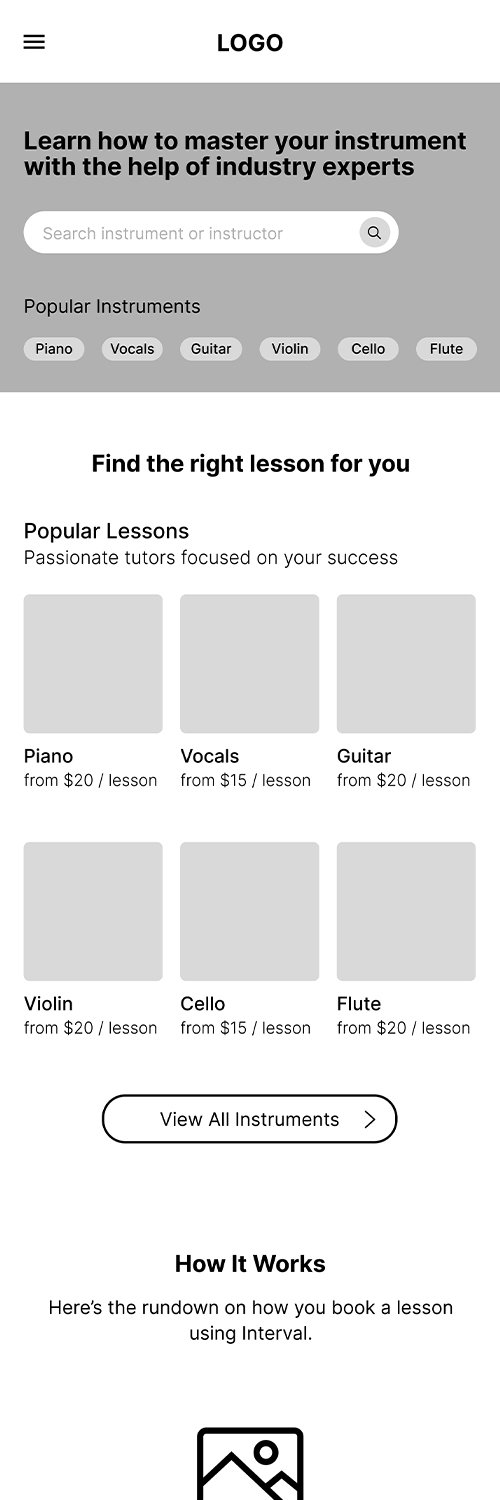
With our newly created medium fidelity wireframes, we begin testing a working prototype and asking users to reschedule a lesson within our prototype as set in our user flow. We will time how long each participant takes and discuss their thinking process while navigating the prototype. This will provide us with vital information on where we can improve our prototype.
We tested three users with a mixture of those who have experience with teaching music and those who have no musical background and have never given a lesson. Our platform should be simple to use no matter the experience or background of the user. Even if they’re not sure where to go, our platform needs to show them how to quickly and easily navigate where they need to go.

The participants were asked to reschedule a booked lesson for a student to determine how easy it is to navigate to the dashboard, booked lessons, and scheduling process.


Usability Test 1 Revisions
Based on the results and observations of our first usability test, we have ideas on what can be improved with our initial design.
Preparing for Usability Test 2
Make sure to really delve into what the user was thinking when making their decisions. The first usability test was not thorough enough and more in-depth conversation and observation is necessary.
We've received solid feedback on our product and know how we can improve the experience...
... Now let's improve and create a higher fidelity product for further usability testing
The look I attempted to attain was one that was professional and legitimate while still being lively and colorful. The use of gradients and proper and appropriate imagery all played a roll in this. I stayed away from images of real people in hero section and throughout the interface except for the faces of instructors in an attempt to represent them as the real people who will connect and interact with you.
With a basic design system in place and changes made to our platform based on information from our previous round of usability testing, we focus on turning our lower fidelity concepts into a higher, more defined product and another round of usability testing.


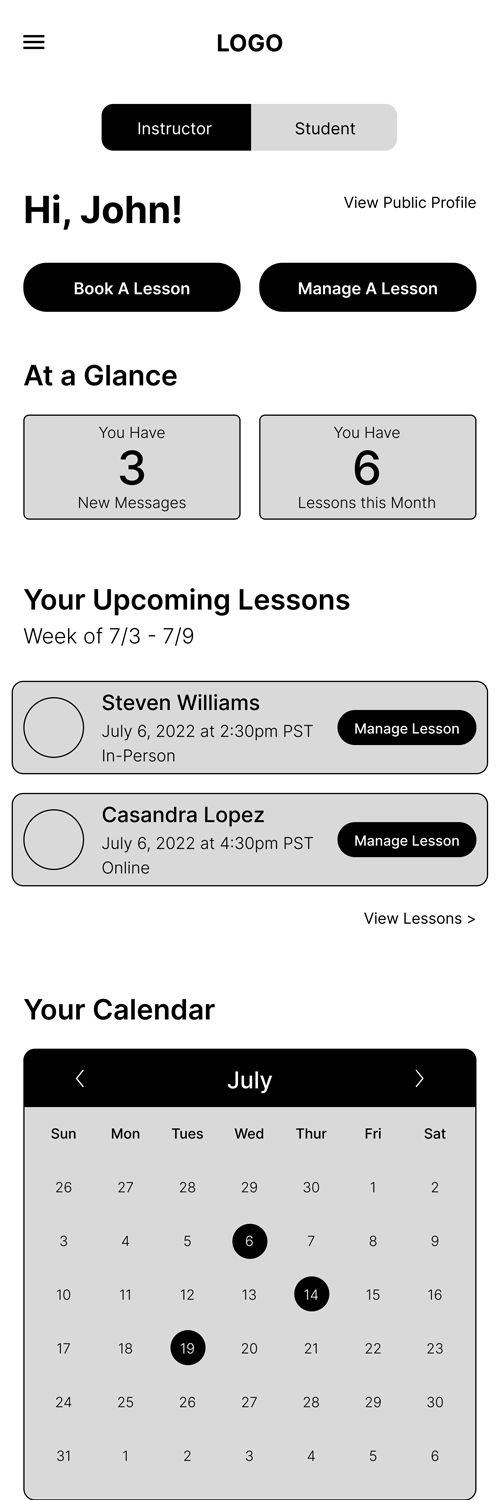
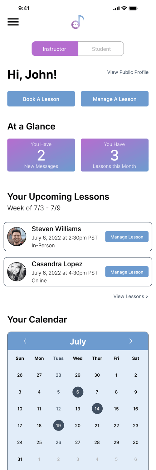
Armed with the knowledge gained from usability testing and an updated, high fidelity prototype, I had a more refined product that was ready for further testing.


Improvements from first round of usability testing
Faster to complete the required task
Overall less confusion when navigating platform